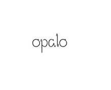
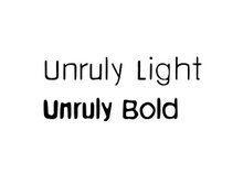
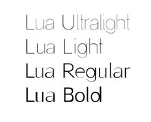
That's the layout I've sent him. I'm using Arial as it is the font I have in mind as the starting point for the sans serif typeface (and it's the one they use for their logo). I'll just do something similar with variations to make it different. I can say now it's very difficult.


1 comment:
I really love the layout, it looks great. Its eye-catching even though the font is very simple. As we were discussing before, the interesting part of your project is giving type 'personality' and I think you are definetly the right person to do that!
Well done so far!
Melissa x
Post a Comment