Redesign of Business Card for company baobab.
(You can see the original few postings below)
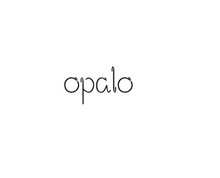
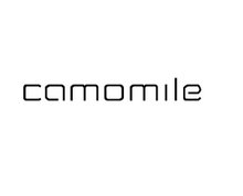
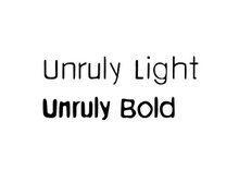
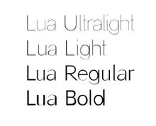
A BOOK DISPLAYING FIVE DESIGNED TYPEFACES ALONG WITH TYPE BASED ILLUSTRATIONS SHOWING FONTS IN CREATIVE APPLICATION. ACCOMPANIED BY RESPONSES/FEEDBACK FROM INDUSTRY TYPOGRAPHERS/DESIGNERS


4 comments:
Cris your bloga nd work is looking brilliant. Just scrolled down the screen and the progress and professionality of you designs are really showing. Good taste and great design! Well done, your clients must be so happy to have you working for them!
Melissa x
Hey, all these fonts are looking great Christina, my favorite so far is Lua Regular.
How did you manage to do so many in this amount of time, no wonder you have to wear glasses now.
Asya
LOL!!! I agree with Asya, thats one of my favourites too. This business card looks very proffessional, and the illustration of the tree is very delicately done!! Welldone, mami! x Doz per uno! lol
Hi Cris
I think this is a really good move to show some illustration within your work it adds depth to your blog and I think you are now feeling comfortable to expand your visuals. I think you have really done well to give an organic and earthy feel to this card without it becoming whimsical. You always manage to come up with something refreshing and thats what I love about your work. Now for the critisism! I think the type is too big at the bottom but its minor!!! good going girl!
Aimeex
Post a Comment