Monday, April 02, 2007
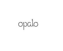
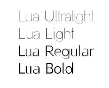
Sans Serif -Lowercase
These are Sans Serif Ultralight and Bold. I was wondering if they should look more different or it's ok that look like many others... (Helvetica, etc.)

Saturday, March 31, 2007
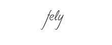
Sans Serif - Pencil
This is a first draft (in pencil). I'm completely sure that I'll change many things once I have diditized it, but that is the idea of my sans serif for the arts.
Normal:
 Light:

Normal:
 Light:
Friday, March 30, 2007
Comments on my layout
Malagra got back to me and he is happy with the layout. He doesn't have the programme yet so we are going to leave it as it is and, meanwhile, I'll try to sort out the new font.
Thursday, March 29, 2007
Layout Theatre Programme
As I had no time to finish the typeface I started checking the taste of the client layout wise...
That's the layout I've sent him. I'm using Arial as it is the font I have in mind as the starting point for the sans serif typeface (and it's the one they use for their logo). I'll just do something similar with variations to make it different. I can say now it's very difficult.

That's the layout I've sent him. I'm using Arial as it is the font I have in mind as the starting point for the sans serif typeface (and it's the one they use for their logo). I'll just do something similar with variations to make it different. I can say now it's very difficult.

Wednesday, March 28, 2007
2 nd Typeface - Client: Interior Design Studio (Logo)
The interior design studio Baobab from Santiago de Compostela (Spain) offered me their card to be redesigned.
As they know I'm doing a typographic project and I have my 4 different categories to create I will work on only one of the typefaces that are in the card -the logo as CORPORATE IDENTITY.

As they know I'm doing a typographic project and I have my 4 different categories to create I will work on only one of the typefaces that are in the card -the logo as CORPORATE IDENTITY.

1st Typeface - Client: Theatre (Programme)
Even though it's been difficult to get clients without having anything to show them yet I got my SANS SERIF to be used in a poster for a theatre programme.
The client is a pub in Spain called GARIGOLO café-teatro that once a week have a performance in the space available downstairs.
The images below are previous posters done by Manu Lago (Malagra) who offered me total freedom to design the next one (April-May).
The only limitations would be:
The format - they want 2 posters to fit on one A3.
Their logo - arial black.
I'm waiting to have the programme to start with the layout but I started with the typeface... So far I only can say that will be sans serif.

The client is a pub in Spain called GARIGOLO café-teatro that once a week have a performance in the space available downstairs.
The images below are previous posters done by Manu Lago (Malagra) who offered me total freedom to design the next one (April-May).
The only limitations would be:
The format - they want 2 posters to fit on one A3.
Their logo - arial black.
I'm waiting to have the programme to start with the layout but I started with the typeface... So far I only can say that will be sans serif.

Tuesday, March 27, 2007
Themes
To clarify the direction of my project for the following 9 weeks, I have compiled a list of the various themes for the fonts I will be making and the clients I have secured for each of these themes.
After completion, all fonts will be available online.
(The classifications below are taken from www.dafont.com)
1. SCRIPT
Calligraphy/Handwritten - Uppercase & Lowercase
Samples:


2. BASIC
2.1 Sans serif - Uppercase & Lowercase (4 weights: Ultralight, Light, Regular and Bold)
Client: Garigolo "Cafe-Teatro"
Sample:

2.2 Serif - Uppercase & Lowercase (Italics, Normal and Bold)
Sample:

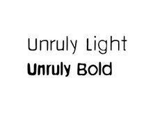
3. FANCY
Distorted - Uppercase & Lowercase.
Client: Unruly
Sample:

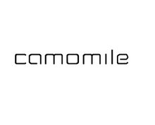
4- TECHNO
Various - Lowercase. 3 Weights (Light, Regular and Bold)
Client: baobao (Interior Design studio)
Sample:

After completion, all fonts will be available online.
(The classifications below are taken from www.dafont.com)
1. SCRIPT
Calligraphy/Handwritten - Uppercase & Lowercase
Samples:


2. BASIC
2.1 Sans serif - Uppercase & Lowercase (4 weights: Ultralight, Light, Regular and Bold)
Client: Garigolo "Cafe-Teatro"
Sample:

2.2 Serif - Uppercase & Lowercase (Italics, Normal and Bold)
Sample:

3. FANCY
Distorted - Uppercase & Lowercase.
Client: Unruly
Sample:

4- TECHNO
Various - Lowercase. 3 Weights (Light, Regular and Bold)
Client: baobao (Interior Design studio)
Sample:

Sunday, March 25, 2007
Book: DIVERSItype
To collect the different fonts, opinions and outcomes I'm doing for clients I'm going to create a book. It will contain:
-the different fonts (name, sample, etc)
-the outcomes (as I'm designing fonts for different people) and
-comments from published typographers (editing and designing a typographic layout as a presentation for each font).
The size will be 19.50 x 21 cm, 38 pages, high quality double sided matt coated paper and perfect binding.
The cover would have the word diversitype cos I think this summarizes my project. Diverse opinions on diverse typefaces for diverse clients by diverse designers.
And it's a book because I want my my FMP to be in the field of editorial design.

-the different fonts (name, sample, etc)
-the outcomes (as I'm designing fonts for different people) and
-comments from published typographers (editing and designing a typographic layout as a presentation for each font).
The size will be 19.50 x 21 cm, 38 pages, high quality double sided matt coated paper and perfect binding.
The cover would have the word diversitype cos I think this summarizes my project. Diverse opinions on diverse typefaces for diverse clients by diverse designers.
And it's a book because I want my my FMP to be in the field of editorial design.

Subscribe to:
Posts (Atom)