Wednesday, May 30, 2007
Sunday, May 27, 2007
Downloads at Dafont.com!!
Friday, May 25, 2007
Prints arrived!
Wednesday, May 23, 2007
Monday, May 21, 2007
Thursday, May 17, 2007
Wednesday, May 16, 2007
Tuesday, May 15, 2007
Sunday, May 13, 2007
Saturday, May 12, 2007
Friday, May 11, 2007
Thursday, May 10, 2007
Wednesday, May 09, 2007
Sunday, May 06, 2007
Saturday, May 05, 2007
Thursday, May 03, 2007
Monday, April 30, 2007
3. Camomile
Friday, April 27, 2007
Very First Draft


That would be the organization for each font:
- Name of the font and where it comes from (from a classic, from scratch...)
- The actual font (all weights) and Outcome.
- Comments from designers/typographers.
The last will be edited and designed as an image using the text/feedback I'm getting from the designers. A type-based image.
Sunday, April 22, 2007
Saturday, April 21, 2007
Friday, April 20, 2007
3rd Font - Inspiration From a Logo
Thursday, April 19, 2007
Complications... by Lee Fasciani
It seems that it's not as easy to design fonts! Here are some valuable comments from LEE FASCIANI:
Hi cristina,
Although you cant really make ‘mistakes’ with designing font – as all work could be seen as subjective – there are some basic principles that I follow.
One of these would be never bastardize an existing font for self-publicising purposes. I say this because:
1. People can see you have basically altered an existing font – in this case helvetica [this is also the most recognised font in the world]
2. This can seem ‘lazy’ in the eyes of type designers
3. Although it doesn’t really matter in your situation, if you wanted to sell any of your creations – there are very strict legal implications when generating fonts from existing typefaces.
My best advise would be to start designing fonts from scratch. It will take you much longer, but if you are passionate about type design, you’ll begin to learn the intricate and delicate nature of the pratice.
I hope that helps
Wednesday, April 18, 2007
Typographer FRASER MUGGERIDGE... Feedback!
Here are my comments - I could write a long email but I will keep it brief
Its good to see that you are into type and making typefaces - I'm sure you have discovered that it is a very lengthy process but you seem to have the basics pretty sorted
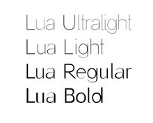
Lua
The difference between the thin and thick strokes on the lower case is good - but there is no difference between the thick and thins in the upper case which might make make it look weird- numbers are nice. How much testing have you done - sample sheets, kerning, spacing? How do the letters fit together? What about other characters, ligatures, punctuation, italic etc
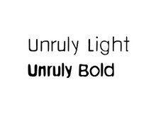
Unruly
This I find a little dated - kind of what Neville brody did in the early 90's - but hey that's just my critical opinion - its well done and looks good for what it is intended to be -
So I hope you find these useful - If you let me know when the final degree shows are on I will try and make it along
Fraser
Lua... "LIVE"
Tuesday, April 17, 2007
Monday, April 16, 2007
Friday, April 13, 2007
Thursday, April 12, 2007
1. Lua
This is the Sans Serif typeface that I called Lua (meaning moon). There are 4 different weights these being Bold, Regular, Light and Ultralight. I've already installed it in my computer so I can start working with it and do the programme for the theatre and the promotional poster for the font itself. I'll also try to get feedback from typographers.


Click image to enlarge
Subscribe to:
Posts (Atom)


