A BOOK DISPLAYING FIVE DESIGNED TYPEFACES ALONG WITH TYPE BASED ILLUSTRATIONS SHOWING FONTS IN CREATIVE APPLICATION. ACCOMPANIED BY RESPONSES/FEEDBACK FROM INDUSTRY TYPOGRAPHERS/DESIGNERS
Monday, April 02, 2007
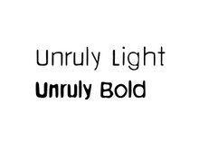
Sans Serif -Lowercase
These are Sans Serif Ultralight and Bold. I was wondering if they should look more different or it's ok that look like many others... (Helvetica, etc.)
Really like the light version here, Cristina... can see myself using it. Heavier version I'm not sure is working so well... loses some of the finesse.
Sorry lame comment... brain a bit broken.
I thought about your offer to design a typeface for Susie Burstein but in the end reasoned that this is something I need to cover myself. She also accepted the logo I designed already. Good luck in finding a suitable fashion client though.
I agree with Mr/Mrs X, ligth looks brilliant. I would def use it. I just wonder whether you can have an alternate- i.e the same font, but have a few quirks within the alphabet, this way is stops it from looking like anything else, even though at first glance it appears to be very simple.
I also agree with Melissa the light version looks very elegant and usable. If we are being meticulous something needs to altered on certain glyphs like the 'g' and maybe like Mel was saying you could differntiate your type from any other with sheer angles on certian glyphs as well. I think the evolution of drawn to digital is a really beautiful process, glad your showing us.
And Aleister, I'm glad that you're doing the font yourself I just thought you wouldn't have time as the whole process of designing a typeface is very time consuming.
I would suggest don't leave it for the last thing. C*


5 comments:
Really like the light version here, Cristina... can see myself using it. Heavier version I'm not sure is working so well... loses some of the finesse.
Sorry lame comment... brain a bit broken.
I thought about your offer to design a typeface for Susie Burstein but in the end reasoned that this is something I need to cover myself. She also accepted the logo I designed already. Good luck in finding a suitable fashion client though.
I agree with Mr/Mrs X, ligth looks brilliant. I would def use it. I just wonder whether you can have an alternate- i.e the same font, but have a few quirks within the alphabet, this way is stops it from looking like anything else, even though at first glance it appears to be very simple.
Melissa
Hi Cristina
I also agree with Melissa the light version looks very elegant and usable. If we are being meticulous something needs to altered on certain glyphs like the 'g' and maybe like Mel was saying you could differntiate your type from any other with sheer angles on certian glyphs as well. I think the evolution of drawn to digital is a really beautiful process, glad your showing us.
Aimee
Thanks for the comments.
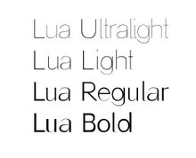
I think exactly the same, I'm very happy with the ultralight version of it but I'm not sure what is the problem with the Bold version.
Yes Aimee, I'm very meticulous and therefore I thank you so much for the comment on the g. This letter is driving me mental!
When you check the capitals let me know!
C.*
And Aleister, I'm glad that you're doing the font yourself I just thought you wouldn't have time as the whole process of designing a typeface is very time consuming.
I would suggest don't leave it for the last thing.
C*
Post a Comment