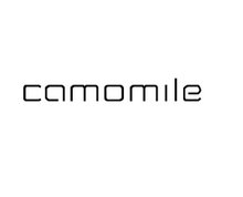
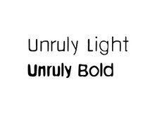
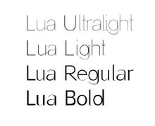
Here there are elements that make the typeface unique (I,K,L) as suggested in the comments. I think is better to keep the lowercase easy to read and "play" with the Uppercase for titles, etc.

A BOOK DISPLAYING FIVE DESIGNED TYPEFACES ALONG WITH TYPE BASED ILLUSTRATIONS SHOWING FONTS IN CREATIVE APPLICATION. ACCOMPANIED BY RESPONSES/FEEDBACK FROM INDUSTRY TYPOGRAPHERS/DESIGNERS


