Here are my comments - I could write a long email but I will keep it brief
Its good to see that you are into type and making typefaces - I'm sure you have discovered that it is a very lengthy process but you seem to have the basics pretty sorted
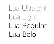
Lua
The difference between the thin and thick strokes on the lower case is good - but there is no difference between the thick and thins in the upper case which might make make it look weird- numbers are nice. How much testing have you done - sample sheets, kerning, spacing? How do the letters fit together? What about other characters, ligatures, punctuation, italic etc
Unruly
This I find a little dated - kind of what Neville brody did in the early 90's - but hey that's just my critical opinion - its well done and looks good for what it is intended to be -
So I hope you find these useful - If you let me know when the final degree shows are on I will try and make it along
Fraser
Wednesday, April 18, 2007
Lua... "LIVE"
The poster with the programme for Café-Teatro Garigolo is already there! These are some pics.

Click image to enlarge

Click image to enlarge
Subscribe to:
Posts (Atom)