A BOOK DISPLAYING FIVE DESIGNED TYPEFACES ALONG WITH TYPE BASED ILLUSTRATIONS SHOWING FONTS IN CREATIVE APPLICATION. ACCOMPANIED BY RESPONSES/FEEDBACK FROM INDUSTRY TYPOGRAPHERS/DESIGNERS
Friday, April 06, 2007
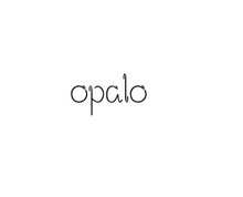
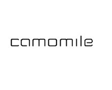
Sans Serif - New Approach
After the comments I received and my own opinion I decided to change my sans serif typeface as I wasn't really happy with what I produced.
I think this is fantastic! I really love the 'flicks' of letters such as 'q'. I see what Aims means about the 'g'. Perhaps this is because this is the only character that is fully extended beyond the base line and has curvature, while the other are more angular. Mel x


2 comments:
I still have a problem with the 'g' ! A personal pref probably but the rest looks more unique. like it
Ax
I think this is fantastic! I really love the 'flicks' of letters such as 'q'. I see what Aims means about the 'g'. Perhaps this is because this is the only character that is fully extended beyond the base line and has curvature, while the other are more angular.
Mel x
Post a Comment