A BOOK DISPLAYING FIVE DESIGNED TYPEFACES ALONG WITH TYPE BASED ILLUSTRATIONS SHOWING FONTS IN CREATIVE APPLICATION. ACCOMPANIED BY RESPONSES/FEEDBACK FROM INDUSTRY TYPOGRAPHERS/DESIGNERS
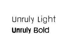
That was fast, you managed to design those fonts quicker than i thaught. I think they fit the brand image really well. The bold one will work really well for titles and headings, and the light will be cool for the price list. I think they are great. Asya
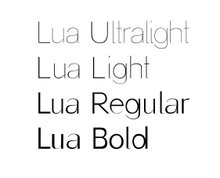
Excellent! I would love to see them in the price list that you've already designed for them and show it to him as it might be the best way for him to visualize what Unruly's font will look like in creative application... could you send me that to my yahoo account? cristina


6 comments:
That was fast, you managed to design those fonts quicker than i thaught.
I think they fit the brand image really well. The bold one will work really well for titles and headings, and the light will be cool for the price list.
I think they are great.
Asya
Excellent!
I would love to see them in the price list that you've already designed for them and show it to him as it might be the best way for him to visualize what Unruly's font will look like in creative application...
could you send me that to my yahoo account?
cristina
The UPPERCASE my fav looks like a stencil
Ax
Do you want to use it for your glasto stencil???
c*
Well done Cris, it's brilliant. i love that the light and bold versions almost look like two separate typefaces. You're almost there now!
Melissa x
It might just fit for what I am doing. I can show it to the designer in my meeting next week and see what he thinks.
Aimx
Post a Comment