A BOOK DISPLAYING FIVE DESIGNED TYPEFACES ALONG WITH TYPE BASED ILLUSTRATIONS SHOWING FONTS IN CREATIVE APPLICATION. ACCOMPANIED BY RESPONSES/FEEDBACK FROM INDUSTRY TYPOGRAPHERS/DESIGNERS
Wednesday, May 16, 2007
2nd Font/Chapter
4 comments:
Anonymous
said...
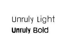
Wow, siniorita! You've worked so hard, and its paid off well. My favourite is Unruly light, I like the fact that its slightly uneven. The bold variation, however, is also working, it will go well with the bright&bold illustrations that asya produces!


4 comments:
Wow, siniorita! You've worked so hard, and its paid off well. My favourite is Unruly light, I like the fact that its slightly uneven. The bold variation, however, is also working, it will go well with the bright&bold illustrations that asya produces!
beautifully illustrated with your bold block shapes that make a statement about the unruly type itself. Are you sticky to the name unruly?
This is so beautiful Cristina, love what you've done, can't wait to see it printed. Well done!
Melissa x
I asked Michel, the director, about using the name unruly but I'm still waiting for a reply...
Cristina
Post a Comment