To clarify the direction of my project for the following 9 weeks, I have compiled a list of the various themes for the fonts I will be making and the clients I have secured for each of these themes.
After completion, all fonts will be available online.
(The classifications below are taken from www.dafont.com)
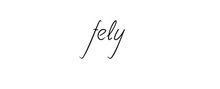
1. SCRIPT
Calligraphy/Handwritten - Uppercase & Lowercase
Samples:


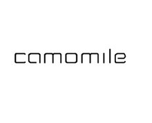
2. BASIC
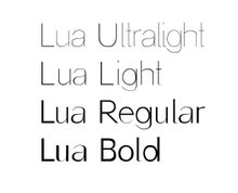
2.1 Sans serif - Uppercase & Lowercase (4 weights: Ultralight, Light, Regular and Bold)
Client: Garigolo "Cafe-Teatro"
Sample:

2.2 Serif - Uppercase & Lowercase (Italics, Normal and Bold)
Sample:

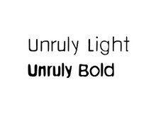
3. FANCY
Distorted - Uppercase & Lowercase.
Client: Unruly
Sample:

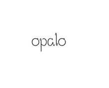
4- TECHNO
Various - Lowercase. 3 Weights (Light, Regular and Bold)
Client: baobao (Interior Design studio)
Sample:


 Light:


