A BOOK DISPLAYING FIVE DESIGNED TYPEFACES ALONG WITH TYPE BASED ILLUSTRATIONS SHOWING FONTS IN CREATIVE APPLICATION. ACCOMPANIED BY RESPONSES/FEEDBACK FROM INDUSTRY TYPOGRAPHERS/DESIGNERS
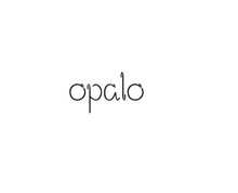
That shows the amount of times that people have downloaded my fonts. I have just found out and I have to say I was quite surprised... In the TOP 100 font downloads Fely is N. 41 and Opalo N. 87 (this month...)
For this font I based my design on a logo posted below.
I did ALL the glyphs cos I've been in contact with T-26 and they said they like this typeface so I might have the chance to be online selling my font. This has been a nightmare and now i wear glasses...
- Name of the font and where it comes from (from a classic, from scratch...) - The actual font (all weights) and Outcome. - Comments from designers/typographers.
The last will be edited and designed as an image using the text/feedback I'm getting from the designers. A type-based image.
It seems that it's not as easy to design fonts! Here are some valuable comments from LEE FASCIANI:
Hi cristina,
Although you cant really make ‘mistakes’ with designing font – as all work could be seen as subjective – there are some basic principles that I follow.
One of these would be never bastardize an existing font for self-publicising purposes. I say this because:
1. People can see you have basically altered an existing font – in this case helvetica [this is also the most recognised font in the world] 2. This can seem ‘lazy’ in the eyes of type designers 3. Although it doesn’t really matter in your situation, if you wanted to sell any of your creations – there are very strict legal implications when generating fonts from existing typefaces.
My best advise would be to start designing fonts from scratch. It will take you much longer, but if you are passionate about type design, you’ll begin to learn the intricate and delicate nature of the pratice.
Here are my comments - I could write a long email but I will keep it brief
Its good to see that you are into type and making typefaces - I'm sure you have discovered that it is a very lengthy process but you seem to have the basics pretty sorted
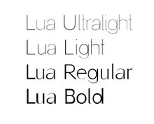
Lua The difference between the thin and thick strokes on the lower case is good - but there is no difference between the thick and thins in the upper case which might make make it look weird- numbers are nice. How much testing have you done - sample sheets, kerning, spacing? How do the letters fit together? What about other characters, ligatures, punctuation, italic etc
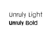
Unruly This I find a little dated - kind of what Neville brody did in the early 90's - but hey that's just my critical opinion - its well done and looks good for what it is intended to be -
So I hope you find these useful - If you let me know when the final degree shows are on I will try and make it along