A BOOK DISPLAYING FIVE DESIGNED TYPEFACES ALONG WITH TYPE BASED ILLUSTRATIONS SHOWING FONTS IN CREATIVE APPLICATION. ACCOMPANIED BY RESPONSES/FEEDBACK FROM INDUSTRY TYPOGRAPHERS/DESIGNERS
For this font I based my design on a logo posted below.
I did ALL the glyphs cos I've been in contact with T-26 and they said they like this typeface so I might have the chance to be online selling my font. This has been a nightmare and now i wear glasses...
- Name of the font and where it comes from (from a classic, from scratch...) - The actual font (all weights) and Outcome. - Comments from designers/typographers.
The last will be edited and designed as an image using the text/feedback I'm getting from the designers. A type-based image.
It seems that it's not as easy to design fonts! Here are some valuable comments from LEE FASCIANI:
Hi cristina,
Although you cant really make ‘mistakes’ with designing font – as all work could be seen as subjective – there are some basic principles that I follow.
One of these would be never bastardize an existing font for self-publicising purposes. I say this because:
1. People can see you have basically altered an existing font – in this case helvetica [this is also the most recognised font in the world] 2. This can seem ‘lazy’ in the eyes of type designers 3. Although it doesn’t really matter in your situation, if you wanted to sell any of your creations – there are very strict legal implications when generating fonts from existing typefaces.
My best advise would be to start designing fonts from scratch. It will take you much longer, but if you are passionate about type design, you’ll begin to learn the intricate and delicate nature of the pratice.
Here are my comments - I could write a long email but I will keep it brief
Its good to see that you are into type and making typefaces - I'm sure you have discovered that it is a very lengthy process but you seem to have the basics pretty sorted
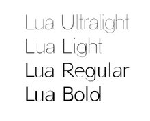
Lua The difference between the thin and thick strokes on the lower case is good - but there is no difference between the thick and thins in the upper case which might make make it look weird- numbers are nice. How much testing have you done - sample sheets, kerning, spacing? How do the letters fit together? What about other characters, ligatures, punctuation, italic etc
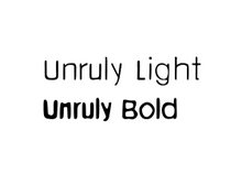
Unruly This I find a little dated - kind of what Neville brody did in the early 90's - but hey that's just my critical opinion - its well done and looks good for what it is intended to be -
So I hope you find these useful - If you let me know when the final degree shows are on I will try and make it along
This is the Sans Serif typeface that I called Lua (meaning moon). There are 4 different weights these being Bold, Regular, Light and Ultralight. I've already installed it in my computer so I can start working with it and do the programme for the theatre and the promotional poster for the font itself. I'll also try to get feedback from typographers.
The typeface for Unruly is going to look like "GhostBlur", a font that I did for a previous project, but it has to be as legible/readable as Myriad -as it is the one they use. Therefore, my intention here is to adapt both to create "Unruly" their own personal typeface for every kind of typographic information that they need to print. They will also like to use it on their web site.
After the meeting with Michael (Unruly's owner) I have a new typeface to design exclusively for him. He likes distorted faces, something informal and quite funky similar to the ghost blur I designed for the horror poster project. Therefore I'm going to redesign this font to make it legible (lighter) basing it on myriad as it's the one they are using at the moment. Then I will need to add all kind of glyphs (from numbers and punctuation to the pound symbol). Quite a lot to do! We have the next meeting in a couple of weeks to test the Unruly typeface in small writing.
I have just talked to Asya on the phone. She asked the man she is working for at Unruly about having his own typeface and he seems to be very interested! He also gives total freedom for the design! This is his image/style:
I'll try to make it fashionable but trying not to compete with the one used as their logo. It will be their typeface for writing all kind of leaflets, price lists, etc.
That is a very first image of what the uppercase of the typeface will look like. I have to correct some of the glyphs cos they don't look as I expected, especially when you type a word... Here there are elements that make the typeface unique (I,K,L) as suggested in the comments. I think is better to keep the lowercase easy to read and "play" with the Uppercase for titles, etc.
These are Sans Serif Ultralight and Bold. I was wondering if they should look more different or it's ok that look like many others... (Helvetica, etc.)